U.S. Bank has grown up, but with a key caveat: “We’re still nice,” said Chief Marketing Officer Michael Lacorazza.
As the Minneapolis-based lender has expanded in size and capabilities, executives saw “enormous value” in the opportunity to be “more inclusive in our storytelling of all the different segments and stakeholders that we serve,” Lacorazza said in a recent interview.
That’s involved a reinvigoration of the company’s branding and visual identity, for which work began in the third quarter of last year.
Initially, the $700 billion-asset bank consulted with a brand firm before deciding “we would be better served to have our own internal creative team take the lead, to get it over the finish line,” Lacorazza said.

Lacorazza’s team collaborated heavily with the bank’s design and legal teams, to ensure compliance with the Americans with Disabilities Act, for example.
Brand refresh work will continue for another year, although changes have been made to the “most visible and impactful touchpoints,” Lacorazza said. “A big chunk of the work is already completed. You see it in our advertising and our digital identity, even in our internal type of channels, things like our PowerPoint presentation templates.”
Through the brand refresh, the bank is telling its story in a bolder way, Lacorazza said. “We have the scale and the credibility to be on this stage now,” he said.
Editor’s note: This interview has been edited for clarity and brevity.
BANKING DIVE: Why did the bank embark on this brand refresh?
MICHAEL LACORAZZA: We have historically been viewed and presented ourselves as this friendly, Midwestern retail bank. Which is true, in terms of our roots, but not reflective of who we’ve become as a company. We're much bigger and broader; we have corporate, commercial, institutional businesses, and wealth management.
From time to time, every brand has to take a fresh look at its visual identity, its tone and language, and how it represents its place in the world, and give it a refresh, to modernize and to be in sync with how it wants to present itself in the most authentic way.
We executed a soup-to-nuts brand identity refresh, including color palettes, presentations, photography style updates. And we're launching a wealth management-specific look and feel that speaks to the sophistication that's expected from those audiences and represents how we show up.
In financial services, many of the products are at parity. This visual identity is one aspect helping us differentiate as a company.
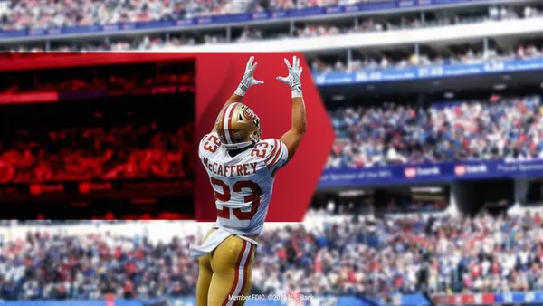
You also see it in some of the decisions we're making in our marketing investments; for example, the “Happy Gilmore” integration, the bank being the official sponsor of the championship event inside of the film. You start to see some of those investments where we're seeking to be more deeply embedded in American culture. Most recently, we announced that we are the official bank and wealth management sponsor of the National Football League.
Our culture previously was, by design, a little bit invisible. We weren't telling our story in big, bold ways.
We're trying to convey that this is a company that has the capabilities and expertise to deliver to a broader set of segments and client types. We’re here, we've arrived, we're relevant, and we have the scale and the credibility to be on this stage now.
What are the most visible elements of the refresh?
Color has impactful, emotional responses. We’ve migrated to more of a jewel-tone approach in much of what we’re doing, particularly in the wealth space. It projects sophistication, and hopefully makes it feel like a more premium brand.
There are also the novel ways that we pulled through the U.S. Bank shield design. You see that showing up in our advertising, in our internal templates. Sometimes a shield forms an arrow to create motion, energy and upward trajectory. Those shapes come into play in different ways as well, even in Elavon, our enterprise grade payments platform. There was a refresh of the Elavon brand, so it’s clear that it’s part of U.S. Bank, using elements of the U.S. Bank shield in constructing the Elavon identity.
We’ve been upgrading and refreshing our photographic approach, which is more modern, more sophisticated. In our category, you see a sea of sameness in the photographic style – it’s people smiling looking at their phones. We are working hard to separate ourselves from the trope nature of how visual identities and photography are presented for financial services brands, so that it’s hopefully seen as something a little bit different. We're highlighting business environments, architecture and the color tones in the photography that signal a higher level of sophistication, and the ability to serve enterprise-grade business-to-business audiences in the right channels and environments.
Our guidelines will give examples of tone and language that we use to help people executing this work be consistent. In some cases, we may create more specific rubrics: Let's say we're trying to bring to life a certain value proposition, like our Smartly suite. We have more prescriptive language that we use for how to describe the products, which is a way of getting not just consistency in brand, but it's regulatory, too, driving these things in certain ways.
Who does the bank seek to attract through this refresh?
On the consumer side, like every other competitor, you’re always trying to bring in the next generation of your franchise, or the young affluent. They grow with you, their careers grow, their families expand, they have needs to buy homes and need credit and so forth. You're trying to bring folks in earlier in the arc of their careers and their lives.
In small business and business banking, we’ve been leaning into some key verticals where we have strong capabilities for products and guidance, like healthcare. That spans larger small businesses to institutional clients; we have multiple business sizes we can serve, from a dentistry practice all the way up through a Fortune 500 insurance company. And acquiring BTIG will give us expanded capabilities in mergers and acquisitions and investment banking.
How do you measure the success of an initiative like this?
We have a robust set of metrics for how we measure our brand health, from attitudinal types of things, like awareness and consideration, all the way through the funnel. At a brand level, we can measure the economic impact of our marketing investments, like sponsorships. We also have client metrics around customer experience that we track pretty closely, to understand how we're performing from a customer satisfaction perspective.
I don't necessarily expect a brand identity refresher has a direct impact on that that you can capture. At the same time, we should see greater emotional engagement, that the work we do has higher levels of efficiency and effectiveness, because our storytelling lands in a more compelling way.
We're trying to measure the impact of the collective set of decisions that we've made.